Build A Search UI with Angular and Elasticsearch
Follow along tutorial to build a SaaS search UI with Angular and Elasticsearch, uses the headless Searchbase library

Building A Search UI with Angular and Elasticsearch
In this post, we will explore how to build a production grade search experience using Angular and Elasticsearch — two of the most popular dev tools.
Angular is one of the earliest and still popular declarative frameworks for building rich web and mobile applications. Elasticsearch being the most popular search engine makes for a good choice for powering application search experiences. In this post, we will show how to build a search and faceted search experience using a dataset of Github repositories to search on. The UI will make use of Searchbase, appbase.io’s open-source (Apache 2.0 licensed) headless library that provides scaffolding for creating search interfaces in JavaScript. Searchbase is the core that powers all the Searchbox UI components that appbase.io offers — for React, Vue, React Native, which are collectively used by thousands of projects today.
This is what our final app will look like. You can try it live over here.
Before We Start
We are using a dataset of 45K popular Github repositories. We will start by indexing this into Elasticsearch. Here is a link to the JSON dataset.
You can import this to any Elasticsearch index via using the REST APIs. For this blog post, we will make use of appbase.io — which offers a nifty GUI to import JSON / CSV files. Below is a video showing this process. importing data
Once you have the data indexed into appbase.io (or on your choice of Elasticsearch cluster), we can start with building out the search functionality.
Building the Search UI with Angular
Step 1: Base setup — Installing Searchbase
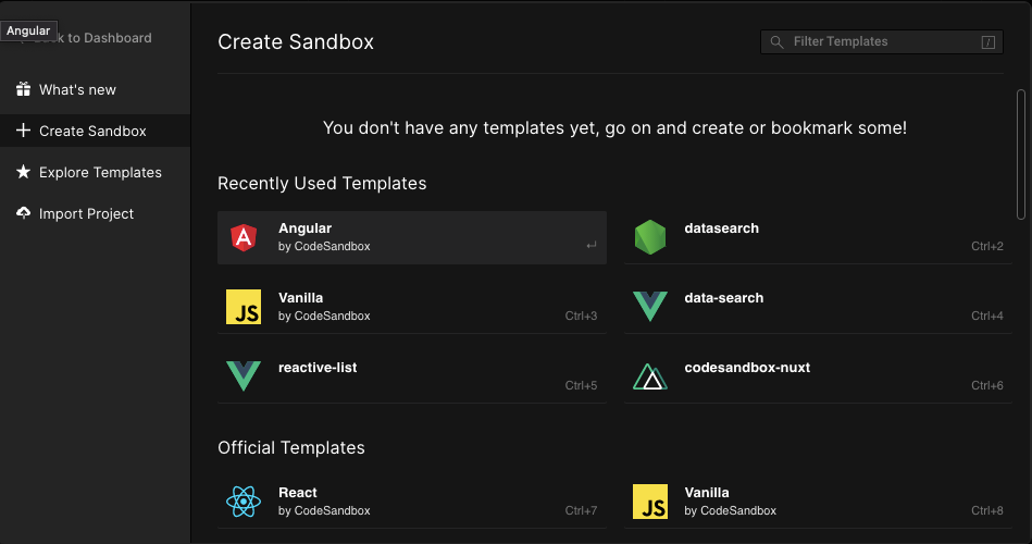
We will use Codesandbox.io to build our Angular application in a step by step fashion. Open the above link and create a new Angular sandbox.
If you want to develop this locally instead, you can use angular-cli to get a boilerplate. You can read more about it here.
Install Searchbase
Now we can add our dependency by clicking the Add Dependency button on CodeSandbox and searching for searchbase, or if you are working locally you can install the package:
yarn add @appbaseio/searchbase
Step 2: Configure search Backend
In this step we would import the @appbaseio/searchbase library in src/app/app.component.ts file to create the search controllers. The searchbase library exports two classes: SearchBase and SearchComponent. The SearchComponent class acts like a search controller that provides necessary utilities to build search interfaces, for examples, to execute Elasticsearch queries and read search/aggregations responses.
If you’re using multiple search UI components which can have dependency on each other then use SearchBase class to initialize a centralized store and register search controllers(SearchComponent) for each search UI component.
Connecting our Search Backend via SearchBase Class
In this demo, we’re going to build three search components:
A component to display relevant search suggestions — this will have a searchbox like look and feel,
A component to select languages to filter the results — this will represent a facet UI,
A component to display the search results with a list UI.
Each search component would be controlled by an instance of the SearchComponent class. And it will utilize the Searchbase class to connect search backend for all the controllers at a single place.
export class AppComponent {
  index = 'git-explore-2022';
  url = 'https://appbase-demo-ansible-abxiydt-arc.searchbase.io';
  credentials = 'b509481af6df:0708b82a-e98e-4884-935e-2bb0e61a82e1';
  searchBase: SearchBase; // SearchBase class from [@appbaseio/searchbase](http://twitter.com/appbaseio/searchbase) package

  constructor() {
   // Create searchbase instance
   this.searchBase = new SearchBase({
     index: this.index,
     url: this.url,
     credentials: this.credentials
   });
  }
}
If you have set up your own search cluster and imported the data, you can replace the above values for index, url and credentials with your own.
Here is the link to the Codesandbox till this step:
Step 3: Building Search UI
Now that we have the SearchBase instance configured, let's start building the search interface by adding search controllers.
Build Search Component with Auto suggestions
The first component is going to be a Text Input with an autosuggestions UI.
Define search controller
To maintain the search state and establish the communication with search backend we have to register a search controller to the SearchBase instance in the following way:
// Define property in AppComponent
searchComponent: SearchComponent;

constructor() {
    ...
   // Register search component => To render the auto-suggestions
    this.searchComponent = this.searchBase.register('search-component', {
      dataField: [
        {
          field: 'description',
          weight: 1
        },
        {
          field: 'description.keyword',
          weight: 1
        },
        {
          field: 'description.search',
          weight: 0.1
        },
        {
          field: 'language',
          weight: 2
        },
        {
          field: 'language.keyword',
          weight: 2
        },
        {
          field: 'language.search',
          weight: 0.2
        },
        {
          field: 'name',
          weight: 5
        },
        {
          field: 'name.keyword',
          weight: 5
        },
        {
          field: 'name.search',
          weight: 0.5
        },
        {
          field: 'owner',
          weight: 1
        },
        {
          field: 'owner.keyword',
          weight: 1
        },
        {
          field: 'owner.search',
          weight: 0.1
        }
      ],
      // Source filtering to improve search latency
      includeFields: [
                'name', 'description', 'owner', 'fullname', 'language', 'topics'
            ],
      size: 5,
      // To clear the filter values when search query gets changed
      clearFiltersOnQueryChange: true,
    });
}
Here, we have registered a new controller with a unique identifier(we’ll refer it as controller id) named search-component. The id must be unique to each controller and it is helpful to define the reactivity among controllers. We'll discuss it later.
The dataField property values are the name of the fields on which we want to apply our search and size represents the number of suggestions to display. Our final goal is to build a relevant search experience so users can find the desired results in a few interactions. To improve the search relevancy we're using multiple data fields with weights, field weights allow weighted search for the index fields. A higher number implies a higher relevance weight for the corresponding field in the search results. A searchable data field has many options to build various kinds of search experiences, some of the most used options are:
keyword: Searches on the exact value of the field. You typically want to enable this and provide it the highest weight.
autosuggest: Searches on the prefix value of the field. Enable this when you want users to do an autocomplete/suggestions search on the field. You should set a relatively lower weight for it.
search: Searches on an infix value of the field. Enable this when you want users to be able to find results by entering partial values. You should set a relatively lower weight for it.
You can try out the different field configurations and choose the best one by using appbase.io’s Searchrelevancy control plane.
Build Autosuggestions UI
To build the auto-suggestions UI we’re going to use angular material library. You can install angular material by following the below command:
ng add @angular/material
Import the autocomplete module and add it in the imports config of app.module.ts file. It would allow us to use the autocomplete components in app.component.html file.
import { MatAutocompleteModule } from '@angular/material/autocomplete';

@NgModule({
  imports: [
    ...
    MatAutocompleteModule
  ],
})
Add an input element to take user input in app.component.html file.
<input
    type="text"
    placeholder="Search Github ..."
    matInput
    [matAutocomplete]="auto"
    class="autocomplete-input"
    [(ngModel)]="searchComponent.value"
    (input)="handleInput($event)"
    id="custom"
  />
We are using the ngModel directive to bind the input value to the searchComponent controller. We have also defined an event(input) to call handleInput method to get suggestions whenever text changes. Let's define the handleInput method in the app.component.ts file.
import { of, Observable, from } from 'rxjs';
import { distinctUntilChanged, switchMap, map } from 'rxjs/operators';

export class AppComponent {
  // A list of suggestions
  suggestions: Observable<any[]>;

    // Method to set the suggestions
    setSuggestions(value) {
    // If value is empty then don't fetch suggestions
    if(!value) {
      this.searchComponent.setValue('', {
        triggerDefaultQuery: false,
        triggerCustomQuery: false,
      });
    } else {
        // Update suggestions when value gets changed
        this.suggestions = of(value).pipe(
          distinctUntilChanged(),
          switchMap(val => {
            this.searchComponent.setValue(val, {
              triggerDefaultQuery: false,
              triggerCustomQuery: false,
            });
            return from(this.searchComponent.triggerDefaultQuery())
            .pipe(
              map(() => this.searchComponent.suggestions))
          })
        )
      }
  }

  // To fetch the suggestions
  handleInput(e) {
    this.setSuggestions(e.target.value);
  };
}
The setSuggestions method calls the setValue method of search controller to set the search controller value. The triggerDefaultQuery method fetches the default query of the controller (to fetch the suggestions). The suggestions property of the search controller would return the parsed suggestions from Elasticsearch.
Now we have the suggestions data ready, Let’s add the auto-complete UI in the app.component.html file in following way:
<mat-autocomplete #auto="matAutocomplete" (optionSelected)="handleOptionSelect($event)">
      <mat-option *ngFor="let suggestion of suggestions | async" [value]="suggestion.value">
        {{suggestion.label}}
      </mat-option>
    </mat-autocomplete>
We have defined an event named optionSelected to call the handleOptionSelect method whenever user selects an option. To update the search results based on selected option we have to call the triggerCustomQuery method of searchComponent controller to update the dependent controllers(we'll add in next steps).
import { MatAutocompleteSelectedEvent } from '@angular/material/autocomplete';

export class AppComponent {
    handleOptionSelect(selectedOption: MatAutocompleteSelectedEvent) {
    this.searchComponent.setValue(selectedOption.option.value, {
      triggerCustomQuery: true, // to update results
      triggerDefaultQuery: true // to update suggestions
    })
  }
}
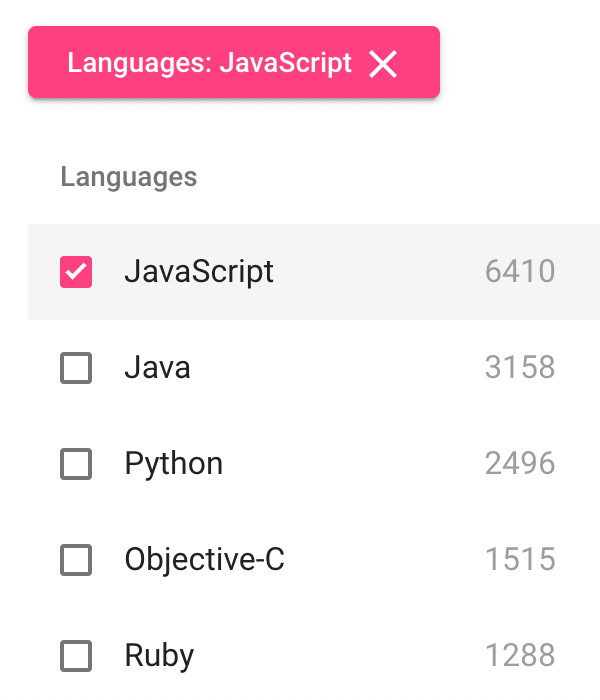
Build Language Filter
The second component we’re going to build is a language filter that would display the unique languages used by Github repositories with an ability to select/deselect them to filter the results.
Define search controller
We have to create a new controller to manage the language filters.
// Define property in AppComponent
filterComponent: SearchComponent;

constructor() {
    ...
    // Register filter component with dependency on search component
    this.filterComponent = this.searchBase.register('language-filter', {
      type: 'term',
      dataField: 'language.keyword',
      aggregationSize: 10,
      size: 0,
      value: [],
      react: {
        and: ['search-component']
      },
    });
}
The filterComponent controller uses the term type of query to get the aggregations from Elasticsearch to display the language options.
The react property allows components to watch each other and update their data reactively. We want to update the language options based on the searchComponent controller. We recommend to read more about the react property to understand the reactivity in depth.
Get Initial Language Options
We want to display to language options at the start so we would fetch the data from Elasticsearch by calling the triggerDefaultQuery method of the filterComponent controller.
export class AppComponent implements AfterContentInit { {
  ngAfterContentInit() {
    // Fetch initial filter options
    this.filterComponent.triggerDefaultQuery();
  }
}
Build UI for language Filter
We would use the MatListModule from Angular material library to build the UI to display language options. Import the MatListModule and add it to the imports list in app.module.ts file.
import { MatListModule } from '@angular/material/list';

@NgModule({
  imports: [
    ...
    MatListModule
  ],
})
Use the mat-selection-list component in the app.component.html file as follows:
<mat-selection-list
   [(ngModel)]="filterComponent.value"
   *ngIf="filterComponent.aggregationData.data.length"
   (selectionChange)="handleSelection($event)"
   #topics
  >
  <h3 matSubheader>Languages</h3>
  <mat-list-option
        checkboxPosition="before"
        *ngFor="let topic of filterComponent.aggregationData.data"
    [value]="topic._key"
   >
   <div class="lang-option">
    <span>{{ topic._key }}</span>
    <span class="count">{{ topic._doc_count }}</span>
   </div>
  </mat-list-option>
 </mat-selection-list>
We have bound the mat-selection-list value to the filterComponent controller's value. We're reading the options from the aggregationData property of the filterComponent controller. To update the results we have to call the triggerCustomQuery method of filterComponent controller whenever language selection changes. Define the handleSelection method as below:
handleSelection() {
  // Update results when language changes
  this.filterComponent.triggerCustomQuery();
}
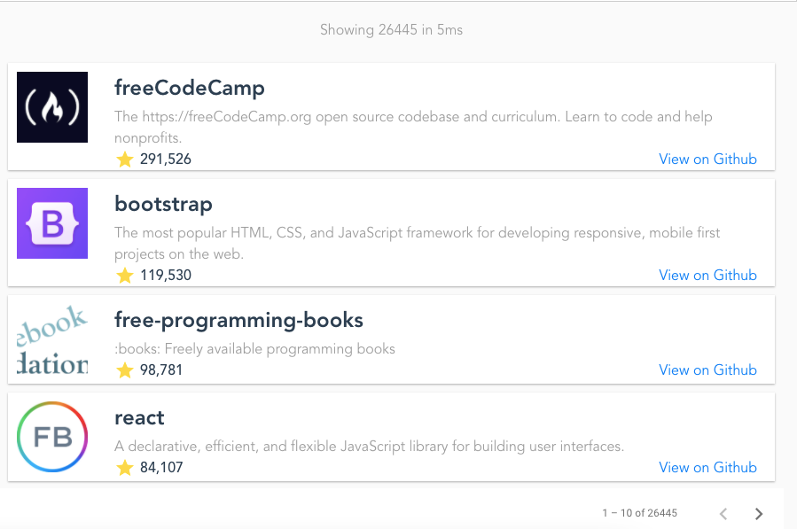
Build Results
The final component is to display the search results based on the search query and languages. The steps would be similar to what we have done with the previous components.
Define search controller
// Define property in AppComponent
resultComponent: SearchComponent;

constructor() {
    ...
    // Register result component with react dependency on search and filter components
    this.resultComponent = this.searchBase.register('result-component', {
      dataField: 'stars',
        sortBy: 'desc',
      react: {
        and: ['search-component', 'language-filter']
      },
      // Source filtering to improve latency
      includeFields: ['name', 'description', 'url', 'avatar', 'stars'],
      from: 0,
      size: 10,
      defaultQuery: () => ({
        track_total_hits: true
      })
    });
}
The resultComponent controller watches the search-component and language-filter to update its data automatically whenever the user selects a value. The defaultQuery prop allows defining additional query params as per Elasticsearch Query DSL. We're sorting the results by the number of stars in descending order.
Get Initial results
To display the results initially we have to fetch it in ngAfterContentInit life cycle method.
export class AppComponent implements AfterContentInit { {
  ngAfterContentInit() {
    // Fetch initial results
    this.resultComponent.triggerDefaultQuery();
  }
}
Build Results Layout
The resultComponent.results property would have the results data from Elasticsearch. Make the following changes in app.component.html to render the results.
<p class="results-stats">
  <span *ngIf="!resultComponent.requestPending && resultComponent.results.data.length">
    Showing {{resultComponent.results.numberOfResults}} in {{resultComponent.results.time}}ms
  </span>
  <span *ngIf="!resultComponent.requestPending && !resultComponent.results.data.length">
    No results found
  </span>
  <span *ngIf="resultComponent.requestPending">
   Loading results...
  </span>
<p>
<div #results id="results">
 <div *ngFor="let item of resultComponent.results.data;">
   <div class="result-set">
     <div>
      <img src={{item.avatar}} alt={{item.name}} />
     </div>
     <div class="details">
      <h4>{{ item.name }}</h4>
      <p>{{ item.description }}</p>
            <div class="item-details">
        <div class="star-icon-parent">
          <mat-icon class="star-icon">star</mat-icon>
          <span class="star-text">{{ item.stars.toLocaleString() }}</span>
        </div>
        <a href={{item.url}} target="blank">View on Github</a>
       </div>
     </div>
   </div>
  </div>
 </div>
Here is the link to the codesandbox till this step. At this point, we have a fully functioning app with only styling remaining:
Step 4: Styling the Application
We will now make use of some styles to make the application look elegant and professional. We can add styles to an element using class and adding their respective CSS in app.component.css.
You can get all the styles here & add them to app app.component.css file in the app folder.
We will also make this app mobile responsive. To do this, we will use a variable to hide/show filters using a button when we are on a mobile viewport.
export class AppComponent implements AfterContentInit {
    showFilters: boolean;
  isMobile: boolean;

  constructor() {
    ....
    this.isMobile = window.innerWidth <= 765;
    this.showFilters = !this.isMobile;
   }
}
Display mat-selection-list only when showFilters is true.
<mat-selection-list
    *ngIf="showFilters && filterComponent.aggregationData.data.length"
>
Display a button to toggle filters view.
<div *ngIf="isMobile" class="example-button-container">
  <button (click)="showFilters = !showFilters" mat-fab color="accent" aria-label="Show filters">
    <mat-icon *ngIf="!showFilters">filter_alt</mat-icon>
    <mat-icon *ngIf="showFilters">close</mat-icon>
  </button>
 </div>
Import MatButtonModule and MatIconModule and add them into imports list in app.module.ts.
import { MatButtonModule } from '@angular/material/button';
import { MatIconModule } from '@angular/material/icon';

...
@NgModule({
  ...
  imports: [
    MatButtonModule,
    MatIconModule
  ],
})
Here is the link to the codesandbox which now includes our styled app:
Step 5: Build A Production Grade Search Experience
So far, we have gone through everything that’s need to build a search interface. However, to make our search experience production grade — we will make some tweaks below to set search relevance and result settings via appbase.io’s control plane instead of having them set via FE code. Setting them via a control plane allows one to tweak search relevance independently of the search interface changes.
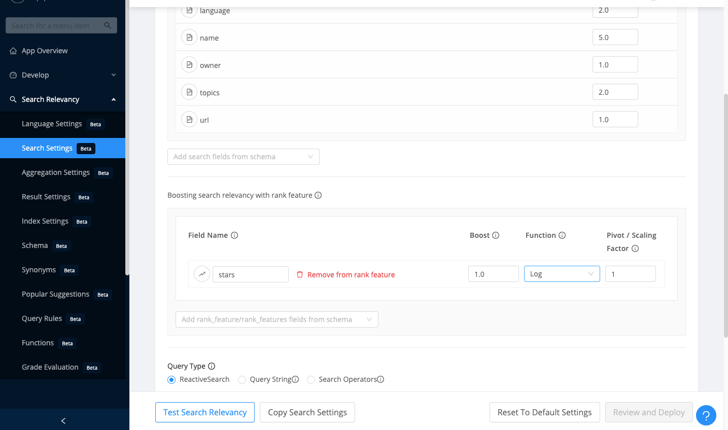
Using Rank Feature
Elasticsearch Rank feature query allows one to boost the relevancy score based on a numeric field. In this case, we will use Github stars to provide a default boost (stars field). This will do pretty useful things:
When no text search criteria is defined, it will sort results by the highest stars,
When a text search criteria is defined, the new relevance will be a combination of the text relevance plus a boost by stars.
We don’t want the rank feature to overpower the text relevance but still influence it in the absence of perfect matches, so we will use a log function here. You can read more about how it works over here. The function and the parameters to use really depend on your use-case, and we recommend tuning them by testing out with varied search terms.
You can configure the rank feature boost and parameters from the Search Settings section of the appbase.io dashboard and then use the Test Search Relevancy view to test it out.
Configure Text Search Relevance with Appbase.io
The Search Settings section of the appbase.io dashboard also allows one to configure the searchable fields and weights. Setting these through the dashboard has the advantage of not having to set these values through code — thus allowing for easy experimentation and relevance optimization in realtime without requiring code deploys.
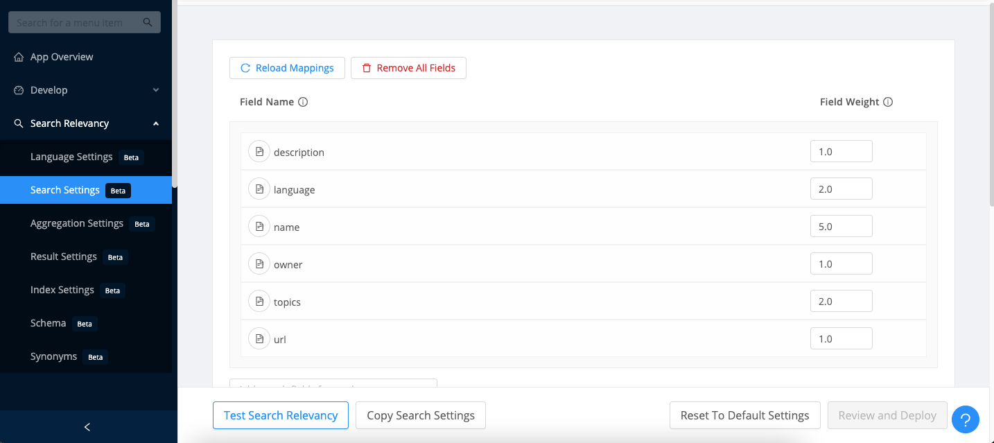
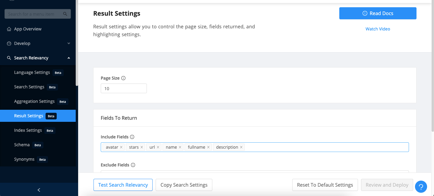
Configure Fields To Return From Result Settings
Elasticsearch source filtering allows filtering the response payload to only return relevant fields. Only returning the fields that are useful to the search UI results in a faster network request as well as better encapsulates your business data. For example, you may have a field containing sales data that you may want to utilize for creating search relevance but never return it to the search client.
Here is the final codesandbox which makes use of appbase.io’s control plane to define search relevance. The only change is that we now remove the dataField and includeFields prop definitions from the FE code:
Summary
We went over the entire process of building a search UI that’s powered by Angular.JS and Elasticsearch. To summarize everything so far:
We start out with the use of Searchbase library for scaffolding our search experience. Searchbase is the underlying library used to power Searchbox libraries for React, Vue and Vanilla JS. While we don’t have an official Angular Searchbox library, Searchbase itself is battle tested and comes with common utilities for connecting search UIs to.
We then integrated different search components for creating Searchbox, Facet and Results experience for our search interface. We use the Material UI components for the interface, but other UI components could be integrated just as easily.
Finally, we style the application and show how to make it production grade by using appbase.io’s control plane.
Links:
Step 1: Base setup of Angular JS with Searchbase (pick Angular template from CSB)
Step 2: Configure search backend
Step 3: Build the search UI
Step 5: Using appbase.io’s control plane to create a production grade search experience
Searchbase itself is open-source (Apache 2.0 licensed) and available under this Github repository.