Tutorial: How To Build A Spotlight Like Search And Navigation Experience
Search, navigate and run JS functions (think actions) with your searchbar
Your Searchbar is the most powerful widget on your site! Offer a SoTA search Ux similar to Spotlight, Chrome, Google, Amazon by integrating search, navigation and the ability to run custom JavaScript functions from right within your searchbar.
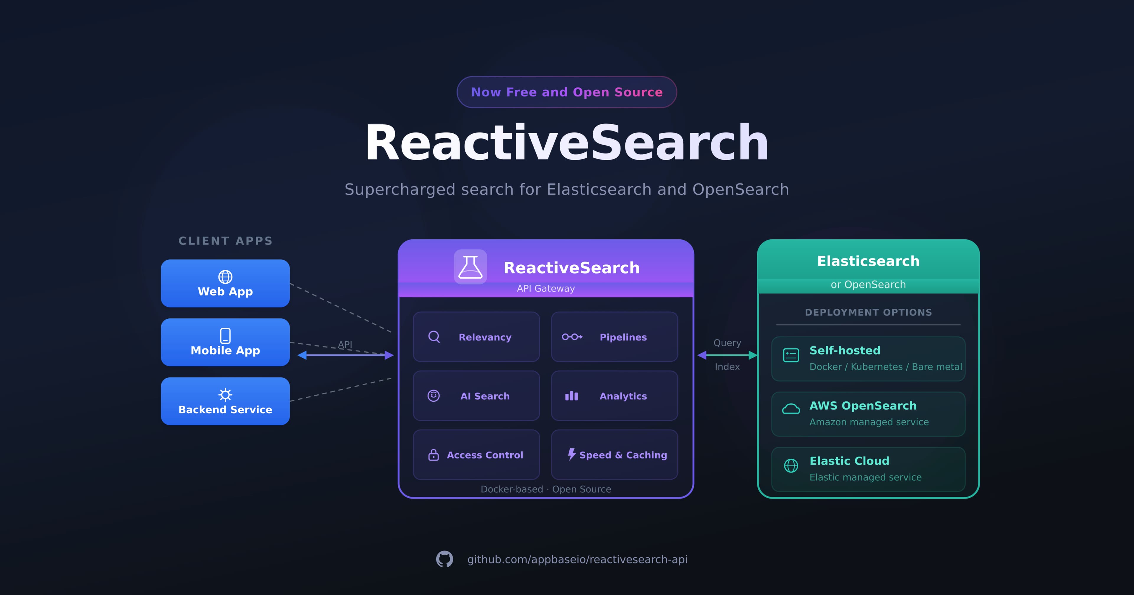
In this tutorial, I will show how to achieve using the SearchBox UI component of ReactiveSearch, an Apache 2.0 licensed search UI kit that works out-of-the-box with search engines such as Elasticsearch, OpenSearch, and MongoDB Atlas Search.
Beyond Search Box
Use cases for using the searchbox component in your application:
In-app navigation: Offer an in-app navigation experience through your searchbar allowing users to navigate through your site or dashboard without needing to jump between multiple menus, or relying on header/footer navigations.
Onboarding of new users: New users who are not familiar with the product or how to use it can just go to the search bar and search for the documentation of the product or search for help if needed. Through the in-app navigation, a user can search for frequently asked questions and navigate to the page effortlessly.
User productivity with actions: When actions like toggling between light mode or dark mode of your app can be done directly from the search bar, it can further enhance the search user experience.
Things You Need
Configuring Reactivesearch for use with React:
Reactivesearch is an Elasticsearch UI component library. It is an open-source library that offers rich and highly customizable UIs that can be used to index Elasticsearch hosted anywhere. We will be using the search box UI provided by Reactivesearch with React to build the spotlight-like search experience.
Postman for making API requests:
Postman is an application used for API testing. It is an HTTP client that tests HTTP requests, utilizing a graphical user interface, through which we obtain different types of responses that need to be subsequently validated. We will be leveraging on making API requests to an endpoint to store our required fields for our search box.
Implementing the SearchBox
Step 1: Setup
Create React App
So let's start by making sure we have node installed on our computer. You can use the command below to check if you have it installed. If you don't, you can install it by clicking here
node -v
// OR
node --version
After installing node on our computer, let's start creating our project. Go into your desired directory and install react. We will be using the popularly known create-react-app to initialize our project. Use the command below in your terminal to install react.
npx create-react-app spotlight-search
cd spotlight-search
npm start
Note: npx comes with npm 5.2+ and higher, see instructions for an older release here.
After creating your react app, it comes with a great folder structure like the one below.
spotlight-search

    ├── README.md
    ├── node_modules
    ├── package.json
    ├── .gitignore
    ├── package-lock.json
    ├── public
    │   └── favicon.ico
    │   └── index.html
    │   └── manifest.json
    └── src
        └── App.css
        └── App.js
        └── App.test.js
        └── index.css
        └── index.js
        └── logo.svg
        └── registerServiceWorker.js
Install Reactive Search
Next, we will be installing the ReactiveSearch library using the command below on our terminal
npm install @appbaseio/reactivesearch
You can clone the app directly from github here
This is the current state of our app below
Step 2: Building Components
ReactiveBase Component We will use the ReactiveBase component to wrap our whole application in ./src/app.js. ReactiveBase is a container component provided to bind the backend (data source) and the UI components to enable them to interact effectively when there is a change in the data.
import { ReactiveBase } from '@appbaseio/reactivesearch';

function App() {
    return (
        <ReactiveBase
            app='good-books-ds'
            url='https://c3416aa3be0a:1dca7a12-f050-45a7-80e8-d9f296a06e4f@appbase-demo-ansible-abxiydt-arc.searchbase.io'
            enableAppbase
            appbaseConfig={{
                recordAnalytics: true,
                userId: 'jon',
            }}
            themePreset='light'
        ></ReactiveBase>
    );
}
export default App
Note: The
urlpassed in the<ReactiveBase />is a sample credential and not going to work unless generated from the appbase website
From the props passed into the ReactiveBase the most important, we will be talking about is the url. The url is connecting our frontend with our backend to allow communication between the client-side and the server or data source. For this tutorial, we will be creating and hosting our data on the appbase app. Create an appbase account and follow the instructions to create a cluster. You can manage your data set graphically using dejavu by providing the url and app name in the fields given in the app. For this app, you can view the data set by following this link
Refer to the github page to clone the current state of the app.
You can read more about the other props by visiting the appbase documentation on ReactiveBase
SearchBox Component
<SearchBox /> is a component used in building the interface for a search box. It offers a lightweight and performant Searchbox UI that can search on an index as well as offer search and navigation on curated suggestions.
<SearchBox
    title='SearchBox'
    defaultValue=''
    dataField={['original_title', 'original_title.search']}
    componentId='BookSensor'
    highlight
    URLParams
    enablePopularSuggestions
    popularSuggestionsConfig={{
        size: 3,
        minChars: 2,
        index: 'good-books-ds',
    }}
    enableRecentSuggestions
    recentSuggestionsConfig={{
        size: 3,
        index: 'good-books-ds',
        minChars: 4,
    }}
    size={14}
    enablePredictiveSuggestions
    index='good-books-ds'
    showClear
    renderNoSuggestion='No suggestions found.'
    innerClass={{
        'suggestion-item': 'test-suggestion',
        'active-suggestion-item': 'active-test-suggestion',
        'section-header': 'section-header',
    }}
 />
Below I will briefly talk about some of the props supplied to the search box and their functions.
dataField: The
dataFieldtakes an array of strings that can be used to specify which field in the database is being searched when the query is passed.enablePopularSuggestions and popularSuggestionsConfig: This is used to specify how popular searches are displayed on the suggestion section of the search bar. It also applies to the other suggestions like the recent and predictive suggestions
size: The
sizevalue is used to specify how many suggestions in total are being displayed. The default is 10 but can be changed based on what suits your needs.innerClass: The
innerClassprop can be used to access each field in the search box which can help us in styling how we want our search UI looks.
You can read more about the SearchBox here.
The sandbox below is the state of our app after adding the search box
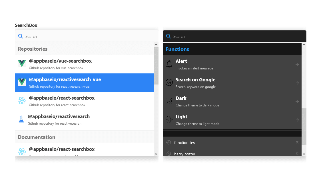
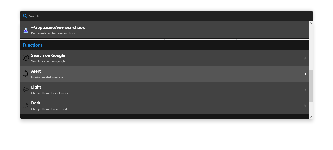
Step 3: Introduction to featuredSuggestions
The featuredSuggestions prop is the newly added functionality for the <SearchBox /> component where it comes with a variety of use cases but most importantly improves the user experience of our application. Below I will show you how to add and use the prop in our book search website we have created so far. The highlight of what we will be doing is adding a function to toggle between the light and dark mode of our website, navigating to an external link on a new page, and adding a function to trigger an alert on the window of the browser.
Going back to our <SearchBox /> component, we are going to add an extra prop to enable the featuredSuggestions and ingest our data from an external source.
enableFeaturedSuggestions={true}
featuredSuggestionsConfig={{
    featuredSuggestionsGroupId: 'spotlight-search', // # mandatory
    maxSuggestionsPerSection: 10,
    sectionsOrder: ['repositories', 'docs', 'functions'],
}}
After adding this block of code, our search box will have a different but aesthetic look. The picture below illustrates how our search box is displayed when expanded.
Next, I will be explaining what the props of the featuredSuggestions are and I will take you through how to add the new functionalities to your <SearchBox /> component.
enableFeaturedSuggestions: This prop tells the
<SearchBox />to enable the use of thefeaturedSuggestionsfeature for our search bar. It takes in a boolean value which that is either true or false. To use thefeaturedSuggestions, we set the value to true as seen above.featuredSuggestionsConfig: This takes the configuration of how we want to structure our omnibar which gives us the spotlight experience which enhances our search bar and gives the user ease in navigating throughout our webpage and beyond. This prop takes a series of arguments wrapped into double curly braces. I will further break down those attributes in the next section.
Step 4: Styling our component
To give our application a unique look to make it stand out and also appeal to our users, I decided to create a custom styling that targets the tags and class names given in our component building stage.
The CSS styling below is linked to our app to give it a unique look as you will also see in a sandbox shortly.
body {
  max-width: 1200px;
  margin: 0 auto;
  padding-top: 15px;
  padding-inline:15px;
}

.test-suggestion img {
  height: 25px;
  max-height: 25px !important;
}
.active-test-suggestion img {
  height: 25px;
  max-height: 25px !important;
}

.section-header h2{
  margin:0;
}
So here we are, we have built the interface of our application. Below is a sandbox showing the progress of what our application currently is.
Step 5: Details about building featuredSuggestions
To create the featuredSuggestions section in our application, we need to perform a request to a backend API that is going to populate our featured suggestions section or the omnibar section. Below we have a cURL making a PUT request to a backend endpoint.
curl --location -g --request PUT 'http://{{user}}:{{password}}@{{host}}/_featured_suggestions_group/{{featured_suggestions_group_id}}' \
--header 'Content-Type: application/json' \
--data-raw '{
    "sectionLabels": {
        "repositories": {
            "label": "<h2>Repositories</h2>"
        },
        "docs": {
            "label": "<h2>Documentation</h2>"
        },
        "functions": {
            "label": "<h2>Functions</h2>"
        }
    },
    "suggestions": [
        {
            "label": "<h3>@appbaseio/reactivesearch</h3>",
            "value": "reactivesearch repository",
            "description": "Github repository for <mark>reactivesearch</mark>",
            "action": "navigate",
            "subAction": "{\"link\": \"https://github.com/appbaseio/reactivesearch\", \"target\": \"_blank\" }",
            "sectionId": "repositories",
            "iconURL": "https://camo.githubusercontent.com/95874e325a752e6ffb604991feb719c6e8bae6a552ed23d4a566bc4d518bc090/68747470733a2f2f692e696d6775722e636f6d2f696952397741732e706e67",
            "order": 1
        },
        {
            "label": "<h3>@appbaseio/reactivesearch-vue</h3>",
            "value": "reactivesearch repository for vuejs",
            "description": "Github repository for <mark>reactivesearch-vue</mark>",
            "action": "navigate",
            "subAction": "{\"link\": \"https://github.com/appbaseio/reactivesearch/tree/next/packages/vue\", \"target\": \"_blank\" }",
            "sectionId": "repositories",
            "iconURL": "https://camo.githubusercontent.com/95874e325a752e6ffb604991feb719c6e8bae6a552ed23d4a566bc4d518bc090/68747470733a2f2f692e696d6775722e636f6d2f696952397741732e706e67",
            "order": 2
        },
        {
            "label": "<h3>@appbaseio/react-searchbox</h3>",
            "value": "appbase react-searchbox repository",
            "description": "Github repository for <mark>react-searchbox</mark>",
            "action": "navigate",
            "subAction": "{\"link\": \"https://github.com/appbaseio/searchbox/tree/master/packages/react-searchbox\", \"target\": \"_blank\" }",
            "sectionId": "repositories",
            "iconURL": "https://camo.githubusercontent.com/95874e325a752e6ffb604991feb719c6e8bae6a552ed23d4a566bc4d518bc090/68747470733a2f2f692e696d6775722e636f6d2f696952397741732e706e67",
            "order": 3
        },
        {
            "label": "<h3>@appbaseio/vue-searchbox</h3>",
            "value": "appbase vue-searchbox repository",
            "description": "Github repository for <mark>vue-searchbox</mark>",
            "action": "navigate",
            "subAction": "{\"link\": \"https://github.com/appbaseio/searchbox/tree/master/packages/vue-searchbox\" , \"target\": \"_blank\"}",
            "sectionId": "repositories",
            "iconURL": "https://camo.githubusercontent.com/95874e325a752e6ffb604991feb719c6e8bae6a552ed23d4a566bc4d518bc090/68747470733a2f2f692e696d6775722e636f6d2f696952397741732e706e67",
            "order": 4
        },
        {
            "label": "<h3>@appbaseio/reactivesearch</h3>",
            "value": "reactivesearch repository",
            "description": "Documentation for <mark>reactivesearch</mark>",
            "action": "navigate",
            "subAction": "{\"link\": \"https://docs.appbase.io/docs/reactivesearch/v3/overview/quickstart\", \"target\": \"_blank\" }",
            "sectionId": "docs",
            "iconURL": "https://camo.githubusercontent.com/95874e325a752e6ffb604991feb719c6e8bae6a552ed23d4a566bc4d518bc090/68747470733a2f2f692e696d6775722e636f6d2f696952397741732e706e67",
            "order": 1
        },
        {
            "label": "<h3>@appbaseio/reactivesearch-vue</h3>",
            "value": "documentation for vuejs reactivesearch",
            "description": "Documentation for <mark>reactivesearch-vue</mark>",
            "action": "navigate",
            "subAction": "{\"link\": \"https://docs.appbase.io/docs/reactivesearch/vue/overview/QuickStart\", \"target\": \"_blank\" }",
            "sectionId": "docs",
            "iconURL": "https://camo.githubusercontent.com/95874e325a752e6ffb604991feb719c6e8bae6a552ed23d4a566bc4d518bc090/68747470733a2f2f692e696d6775722e636f6d2f696952397741732e706e67",
            "order": 2
        },
        {
            "label": "<h3>@appbaseio/react-searchbox</h3>",
            "value": "appbase react-searchbox docs",
            "description": "Documentation for <mark>react-searchbox</mark>",
            "action": "navigate",
            "subAction": "{\"link\": \"https://docs.appbase.io/docs/reactivesearch/react-searchbox/quickstart\", \"target\": \"_blank\" }",
            "sectionId": "docs",
            "iconURL": "https://camo.githubusercontent.com/95874e325a752e6ffb604991feb719c6e8bae6a552ed23d4a566bc4d518bc090/68747470733a2f2f692e696d6775722e636f6d2f696952397741732e706e67",
            "order": 3
        },
        {
            "label": "<h3>@appbaseio/vue-searchbox</h3>",
            "value": "appbase vue-searchbox docs",
            "description": "Documentation for <mark>vue-searchbox</mark>",
            "action": "navigate",
            "subAction": "{\"link\": \"https://docs.appbase.io/docs/reactivesearch/vue-searchbox/quickstart\" , \"target\": \"_blank\"}",
            "sectionId": "docs",
            "iconURL": "https://camo.githubusercontent.com/95874e325a752e6ffb604991feb719c6e8bae6a552ed23d4a566bc4d518bc090/68747470733a2f2f692e696d6775722e636f6d2f696952397741732e706e67",
            "order": 4
        },
        {
            "label": "<h3>Alert</h3>",
            "value": "alert",
            "description": "Invokes an alert message",
            "action": "function",
            "subAction": "function() { alert('Hello World! with theme');}",
            "sectionId": "functions",
            "iconURL": "https://www.svgrepo.com/show/281847/bell.svg",
            "order": 1
        },
        {
            "label": "<h3>Light</h3>",
            "value": "light mode",
            "description": "Change theme to light mode",
            "action": "function",
            "subAction": "function(){ window.history.pushState({ theme: 'white'}, '', '/light');window.location.reload();}",
            "sectionId": "functions",
            "iconURL": "https://www.svgrepo.com/show/20546/sun.svg",
            "order": 2
        },
        {
            "label": "<h3>Dark</h3>",
            "value": "dark mode",
            "description": "Change theme to dark mode",
            "action": "function",
            "subAction": " function(){ window.history.pushState({ theme: 'dark'}, '', '/dark');window.location.reload();}",
            "sectionId": "functions",
            "iconURL": "https://www.svgrepo.com/show/8265/moon.svg",
            "order": 3
        },
        {
            "label": "<h3>Search on Google</h3>",
            "value": "google search",
            "description": "Search keyword on google",
            "action": "function",
            "subAction": "function() {window.open('https://www.google.com');}",
            "sectionId": "functions",
            "iconURL": "https://www.svgrepo.com/show/122724/google.svg",
            "order": 4
        }
    ]
}'
The endpoint
The endpoint is used to create or update the list of featured suggestions. In our case, our endpoint will look like the example below:
'https://c3416aa3be0a:1dca7a12-f050-45a7-80e8-d9f296a06e4f@appbase-demo-ansible-abxiydt-arc.searchbase.io/_featured_suggestions_group/spotlight_search'

// Compare the above and below
'http://{{user}}:{{password}}@{{host}}/_featured_suggestions_group/{{featured_suggestions_group_id}}'

// the {{user}}:{{password}}@{{host}} is simply our url from the ReactiveBase container component above
The endpoint takes in a featured_suggestions_group_id that can be anything based on your preference. Using this endpoint perform, a PUT request on postman or any other API testing platform of your choice.
You will pass a body which mainly consists of two main parts sectionLabels and
suggestions.
The appbase.io team is working on providing a GUI for ingesting the featured suggestions which will make it possible to add featured suggestions with a point-and-click control plane.
The body
The body of our request is very vital in this article. Therefore, I will take my time to explain everything using simple terms to make it easy to create one. The body from the above request is written in JSON format, it is passed to the request endpoint body. The body is categorized into two main parts:
- sectionLabels: The section label is used to tell the user what a particular section in the search bar is doing. It helps the user understand what action is performed when he interacts with a component. Below are the section labels from our cURL:
"sectionLabels": {
        "repositories": {
            "label": "<h2>Repositories</h2>"
        },
        "docs": {
            "label": "<h2>Documentation</h2>"
        },
        "functions": {
            "label": "<h2>Functions</h2>"
        }
    },
We have three main sections from the above repositories, docs, and functions. The label which is enclosed within the curly braces is what the user sees when using the UI.
- suggestions: The suggestions are an array that contains all your suggestions and the necessary values needed to display the props, It has different values like the
label,value,action, and so on.
Below we have a sample from our suggestions array above:
        {
            "label": "<h3>@appbaseio/vue-searchbox</h3>",
            "value": "appbase vue-searchbox repository",
            "description": "Github repository for <mark>vue-searchbox</mark>",
            "action": "navigate",
            "subAction": "{\"link\": \"https://github.com/appbaseio/searchbox/tree/master/packages/vue-searchbox\" , \"target\": \"_blank\"}",
            "sectionId": "repositories",
            "iconURL": "https://camo.githubusercontent.com/95874e325a752e6ffb604991feb719c6e8bae6a552ed23d4a566bc4d518bc090/68747470733a2f2f692e696d6775722e636f6d2f696952397741732e706e67",
            "order": 4
        },
Below we have the definition of the necessary values in a suggestion.
- label: The
labelis used to display the name of the suggestion, it accepts HTML and a string depending on how you want the element to be displayed. - value: The
valueelement is used to give the suggestion a unique value. - description: The
descriptionvalue is used to display a mini description under a suggestion for more clarification for the user. action: The
actionis a very essential part of the suggestion. It takes two valuesnavigateandfunction.When
navigateis passed as the action, it identifies that the suggestion is a link element that can be used to navigate through the website or even access an external link. Thefunctionis passed into the action when you have an intention to perform or trigger a function on the website. This function can range from displaying an alert to changing certain flows of the website like toggling between light and dark mode.- subAction: This depends on the action provided. If the provided action is
navigatethen we have to pass a link to the subAction like the below illustration
"subAction": "{\"link\": \"https://docs.appbase.io/docs/reactivesearch/vue-searchbox/quickstart\" , \"target\": \"_blank\"}"
it takes a link pointing to the location of the suggestion and a target value to either open the link on a new page when _blank is passed or open it on the same page when self is passed as the target.
The second action is function, when this is passed the subAction now takes in a function to perform an action on the website. The below illustration shows an example of a function to display an alert
"subAction": "function(currentSuggestion, inputValue, customEvents) { alert('Hello World! with theme');}"
currentSuggestionis the currently selected suggestion item. It's an object having information about the suggestion.inputValueis the current input value of the SearchBox.customEventsis a key-value pair object that is injected via theReactiveBasecomponent as depicted below.
   <Reactivebase
        appbaseConfig={{
                customEvents: {
                    platform: "ios",
                    device: "iphoneX"
                }
        }}
    >
    </Reactivebase>
- sectionId: This takes the value where we want our suggestion to appear. For the
sectionId, you pass any value that is present in thesectionLabels. The suggestion is going to appear among the values in a particular section.
- iconURL or icon: Next, we want to have an icon that will be shown beside our suggestion. We can achieve this in two ways. we can use the
iconURLfor passing an external link to the icon we want to display or use theiconto pass an HTML tag for our icon. The illustration below shows an example of the two use cases"iconURL": "https://www.svgrepo.com/show/281847/bell.svg", // OR "icon": "<img src="<img src=\"data:image/png;base64,iVBORw0KGgoAAAANSUhEUgAAAPEAAADRCAMAAAAquaQNAAABC1BMVEVBuIP////u7u41SV7t7e329vb5+fn8/Pzy8vLx8fFBu4Q9t4E1Rl07t4A1RF01R100PVs0QFxAsIAxtXw6em1CwIY1TV8/qH00OFo2U2E9mng5b2lBtYI2V2I7iHI/pXw3YmWGzas3XWTn8+88knVuwpr1+fcmOVQ5cmo4ZWZZvZE7g3DU6N8isnaOzrHI49aw2MRSu4uZz7eXqKqFpqBKYW6t2MPN49hjv5e84NCa1LiavbPO4tvW8+NbiIIbMU6psbdnno5rdoO8ysmevbUZO1Hl9+xLbHB/hpIRKkp0jI8fTlYjR1eqwbpXYnPa5eKHsKUbXFmx0sZrg4hWgn6HuqXZ292UmaMzKle2S9lbAAAPrElEQVR4nOVdaXubSBKmEc0hwNhRbOeQnThEOFEk2fJMbCvnTGbiuZLxHDu7+/9/yXI2jcTRLwJZ0tbz5IM7EtSrgu63qquqpYEtIXLvyOqIyulbIjMhTHQ2RtNBNqao5N2RI3yPnVddSH9zILlTE/lG99WesDbOs/d6HcTfnorfonMIAZbGI4lcYEbuAgZwPngKjFh791n8Drv3MBPbbzSJeDZm5ONdYX06H99RBURskFc7wte3HvchwKbpGhIhkx70re6xuEbOa0/HECvqd+LPdMd6jpm4N9EUH7F3DT3X3ScPhZ8658tbTYEQ09un4lOj9XQfAmxf+2+Zj5icSdBzvf9SXCengz3VCnkLmHjvEDKxKZ2RCDEBV6juA3Gldj4QA0BMb07Fp629R+C0NSAJ4tEYQ3wfWKFO31MAsfe9OGDr6T1IbX9lYojJOTZ57T8G3rVPVFYUhUesJKKng9EA/eGj8IU7e8fgtHUe3keivqjuFPpu94m4kTunP2qqLzQVNZGFMfISYVvYtCVNXTW4jxT+tuoMNPJDcSN3PnNGDERjhlXTwWjgL3ET+2wLNPFMDR81KZoiKcg1nwA05PTHEHFKqjjEbDD8++YnwMT3QUI9DclQgljWZ9h0Ld0H3uSX7wURf/9FfKXvYGzLN7Eu84hlFaTX+x3AHD+LIR79AqxMoIntC03OIqYGuEI9ByavjzMhxL+KPzc7LzDA0liPGH6KWNEusMkLcZSd1zcCiM9/E76i0wHJR+8iZrspYll2+9jkdQ+h11+rEdPfgZ/wCF6Z4hvxiOkIQiztvwBWqI+3ehXiPwBCvQuyLfuc5iBWVJBe9xF6/WtMrwsR3xwAV3sMAh6wu/uIDSbqTYuO8sEVjW8jq1oianpz8g3iJILTlj3S2X00KaW2lJ5AkLtPDoAV6oNXyqtnf4oj3gPjAPYJz995xLoH0utDceblfHnLEKdTR3rzI+B52QPZVv+KQyzziBUK0usuEhv46JUg/vpZ+EKdXXRlmpFCxIY3xFaoRwC9tr4pRuz9DUTznoHRvKGnFiGWZQOk18gKZf15VYj4R2RlApdic2bQIsT+WuENwSgfskJ9KkQMTFvoJoQ99ORCxIEShtnec/3xrwLEPwPPNLgJYdo+oS5FTFF6jQRbf7rJRXwL8NXOE5RQU6UcsewOoStC+1BfvstF/C2wMqGEeugG8Y7C9zgMroFG3r8P6PvLiCwykBkQzUMJdWjiDGJF0hMxIvZHtDHmURwCjvLO34QaPMvUDXoDzPc79zHA9sDHo2nUYCg1jfck4p9hhG1RQPT6t3M160ko3jfA3qmDkQ9TGrFVKNd3ShQ5ATfRxSeejvU7zcYyqQLszsKbECdEDPEI3F99gUSv/yAZGxMgemQdgWzLHgkiJpcgvX6BuI03hENM3wP+1y66d3pJRBF7WGyg+wgIbDJ6HSJ2/wV8E4zm2QNPGDGZgQEghIb8eZsiVr8CK9MDMA5gMp+pGrFmYD6UdM9BJq/0l/WASQ/dWDOvCYCYnoHRa4Ref/7KbvSP+MpkHaFZPTqCWEGTQ/pAbMB6nExe/0YejRcYv+xNyCLicKeNsRE93eVUdeqCsYHn4tN15/Q/JLiJRj4AXwLdYnPoaumuLY9xgVcHYvh/ofT6gbi5Or+8D7i1+h7ZHgfd4t4FkRmeLK/mELMHPEBMwP3VQ2BhtT55/k28T8jeKWjiKWEh6hLfKYt4hO3KQD7Uwx80Rf3nt9bcYrM/qoFYA+m1BNAQZ8c1vM+Az/QMTNw60YQQKxnExG0vA6hz+i2Sb2q9BLfHxy6pYWM8zQt5rl/PXgNvMUg+gsStWojRFeoRMHk5QKYaGurxV6aaiAkavQZcXURgtzgi1HUQE5BeI/ur4gK7xUMiijjDQEIB6bUEOMoAYDBrvHcWKV/EQJhhZZ5Xx0PeSXtuo6igiVu+WxxZNo21pE9vsSeRPN4yuL/6CFihxMQB3WKffEQBcYV/eoURKyoaALIaNrLjoKGeOHErY2NxxLLiYbNGF0l6EhHrMbgJ0TeU5RDjUb5mEe+hmxCXyUtbGzGZgIsyEA2pFuslSKgnaY1JTcQauQXpNbBFUS0PwK3E8a2xPGI0AIQ4ylWCV/fk5gaiiN1rMDYAuI3l4nRAQn3tatWI0zR2HnEmt/0NGABqjIbsotvjb+ZVTxAnEiCm1YLS68OG6DXqFvuEWgBNOa/26XiwsX2GGVl61YyR4WKXM4NXHY7sxYiDv3UwNtCM24gWu9gDn17qc6qHbzTgLSaIXXATHSkcKZRdMNRjzyiKWClCrFCQefWfLW9kNN+0dx6sTA3Z2DcyGL1+vrSRnWcYvzSnbuAzNYVY1i/bi/IVmBh1iy9DJ7ExxIaHGRmqX80TvIDLMxpFLBu3oJGR6qBFgXPz7NuoBKGhmSv8Fkqvl1qhdkC3uDeJtc9RXcTGeT+UMQInr/4SRnYccNrqj4xi1bN1ziK8Oha0wwJQpDwvMKG+LFWd8oMCvlMsqot2WKi9QsFNL8blqqPeYvI19QoM5dZeodBonnnVCmJVQen14U69ycsC3WJ7UGWsuojpCHyTgeog3sIP0WgeV93TLGJFbTEDKBXUSbQnpC0bBwn27WUAJWIdQXgl077J20BqCLF+CU5eNQKb6Pa4ealVTrr1ERsG5ihLOA2xQLfYlIzqZQaN7LH32P8M2CsFptfOQ5R8nKuVqmcje2p+ZlvRIJoBdA+MDcDtmE40UdWjbEQ9z5PIRvaSwZicou1hgOqgQNCU4qlbqLo8r3og4r5T+jWsSBlkXqhb3DuJVGfvaXP+cfo1D+ywgNRlOw6am+etADHcwAxIDtlBS4vP51VvBTHcYUHYyM4BSqgXVG8FMdzATNhtRN3i8WhFiAm22Sj1BWMDsFt8vah6S4jRFeq50GONPtPxyrQMYqH1OBA0A2i/I2JkeBPislz1ovWYFYpqHEdJB/W8QUMF6bVIaSPqFpv1VNdBXp0MovT6uJp5wXunMyqqet3IHu+AoBlA3co0Lwvt1cOnfLTnLaaIr0DElf2BH6B7p1crRgwbuaJjMdz0YkJWjRim16WTl3NQg1CvGDGcAVQa5dtFm1++IatHjBaO7JfsrzrP6pR+rBzxu+aqg9B2TON3d4IY7bBQ3B/YelyrI0JNxPUYSCgovX5UNF2jbnFMqIVVzzIQxr98Op40o9MJG2SN8GTKBrX4g2CXOmn/IN/IFuhC9E7Cnn0yqaU6Hudij5Oia5iRCwKbaFaPNNX0QIO8QoiMJ5Gvei1vMcnL11F6nUtDUPLROw8BZxAz1Vvyj9nD4IGxgf2cABDqFpvXcX/Tu0CsULR+NWeLAu9rQu8OsX9TtIHZQnPznWNw2rpgL9WdINbQFWo+NuA8BJteRMmId4dYRQ/SmachaD2TfZG2DL4jxC5Yez9Xv4q6xaabarQ8YkZM5nLoI8kkonNk5woNAPGPtXOMAe5dVZAqgRx6bvcx58QHgUGK0mvObYQLuE60mlqmg8vwahJ2CdTBfSiJywDaBZtfSme06FErUz27Yy5z72T6tXQy5hCzj3KI/b8o2mGBVQftwG4xLZpOSlVvzFuMEetwh4XYyNZTtLrH1dcCsaKBDcy6x1ZMPtCOCJqyFoj91QwsAYvrV9F2TNdy8SK5YsTqDG1gFtBrtOnFOKjuWRPEigpnAFkdC3SL7ZMA4poglmWUXvcPnIM+GuoJJ411QUzRcyrv1zzKpgHESzOQaGVXwF4ph/9FD1lT5FKyW6Z6NrKXN15NThdvBeZeS2A+QC9J+cj94SFezX2NmR7xnRIB+6iCkvY3nT8Fa071FXiLTN5hHewhMc3ExGuEWNNaNDJL3ForxMaoNSObEsvqWSfEijprCTCf1bNWiGUZpNeiYk699N5rhVhFOywISu+MFp9YeKeIFdqKke0hzaV+LUX2hBlIQHYM8JgCITGlkVF28iiqulQRFMOiZ+gWhYj0Lki9qGPBB6WAE8shZ80+oXL0H9kfV47+pT+Zzr4ePU4UO6ZAQEw7sJCR6JO1V6TP/MsVK595BOKvN+c7sRcIzFGtlmhlgpaMBdXb8BYZ4qaZV3DOyXojJuBRb1XSK+1vuhaI0TSvckkI9VojvmlwhTKlmw1AjJaAlUlcwLXuiLXGmJc5TG6/RohZSgh/ImhTRk7Phswt16hAnH4wi5g7KTbvBFeuFqF8kKtF8AbNGNkeeKzmIe8+9VRvlFcnfBc8pqBIzBkj0U3yau5rzPR1/WP2ODWyQtkDtfTlWgNvMdWENmBks0+ZRuuPuAl67RPq8gl0vRCDm+h5Jh66G4WYXIG7MgsyvqpaJNcMMVodNC9Bdc+GIV5uhQqPstkwxMsZOTDxChA3xkBCARORsxIeZcNdskkG0gLLjCghWr/KS+88qHLQ5y+5PMvMPyl2aU8iHlFqM68gU02uLvyu6UksiTjvBYpHKJjmlYo5C6+75HSyOv+YFaGoNWmIOYwI9eYh1sEWm4mMz+iGIlY0sD9wJPZlfP/NQyzLaH/gUKZJmvwGIvaNjK9QvcvkTpuImBI4AGQO0rOW1gWxUrkec4snSq+D45nir7ewHs+fJ8H1ZkuG9GXLKDSQXvuEWvg+eulgkert8erokgZ4kM74Vsu75NpH9jhNNKiPam+i0bxLboS3GCH2VyiAeZlDT3wCXVvEyBkrvTO6BYgN8YN0zKGmbAFiwMi9s+qOrpuAWPEmYkY2J958FstmIhbtDxxtQqwUMbtWw4gF+wMHPXtXjbgFBhKJyEE65tSduyR3nyYZCPt12vEkYhEIAJmzRPuGHrU78p0SqSwBCyPUjSJOP3gniL2qN7mXpMlvi42rzlgJW4xtF+JRaZ2fec0+ui2INbW0P3Bef9MNR0xkbVg8ednD9INbg1gxSg7S4Y6y2SLEJR0W7AH3wdYRC/On0tpUJRvZyyU7Oi2g16akct+u2YilTHX4pNimpIhe985FTnhtSpbvciP84xadpGwP3cpLblBkL/vu5xs5mLZqTCdr7B+niPPOWDGnZIsRk8VDduO6061FvNgfOCbU24t4oY1G3N/0bhC37JhGMpdgn6TJb6+N50rA4gKurbZx5iAdUzoTu2QVYkB14ZNis8etJpKqp6aDWs4lOU24TXRzUHZJLe+S3H3qqb5CXp18kHOUxyN94ZKtUr8lzpNIEOf9uOklc9+EtEg5v7/p9niL7JJJf2Dz2kt/hq1GnFRR9C7TYpctRxwdEGVfk2Xn3c1BHExe5tStWNG2CXGQAWRfLL+2bg7i0Idy/68Qk8l40gB/qoV45Qwk0sQ78ZAITpMMhKsmED76Kx3kChTyBtNLcjUP0aBRfR/0kmKq/w9xmh5qjHmmkwAAAABJRU5ErkJggg==\"/>" alt='icon description' height='10' width='10' /> " - order: This simply takes the order in terms of relevance we want to display each suggestion in a section.
You can get the full body of the request here
Step 6: Connecting Everything
Finally, to put everything together, We'll go to the postman and make our request. Make the PUT request to your endpoint based on your credentials gotten from appbase app.
We are going to get a response returning the featured_id we supplied. We will then use that id in our featuredSuggestion prop.
featuredSuggestionsConfig={{
    featuredSuggestionsGroupId: 'spotlight', // id returned after the request.
    maxSuggestionsPerSection: 10,
    sectionsOrder: ['repositories', 'docs', 'functions'],
}}
Our final app will look like the below sandbox now.
You can also access the code on github here
Live Demo and Code
Finally, We have reached the end of our book search app which comes with a spotlight search experience that can give an incredible user search experience. You can access the live site here and the full code is on github which can be accessed here.
Summary
Here is a summary of all the steps we covered in this tutorial to build a Spotlight like search experience with the SearchBox UI component:
If you enjoyed this tutorial, you should 🌟 the ReactiveSearch UI project over here.