7 Powerful Ways To Use The SearchBox Component
CEO @reactivesearch, search engine dx
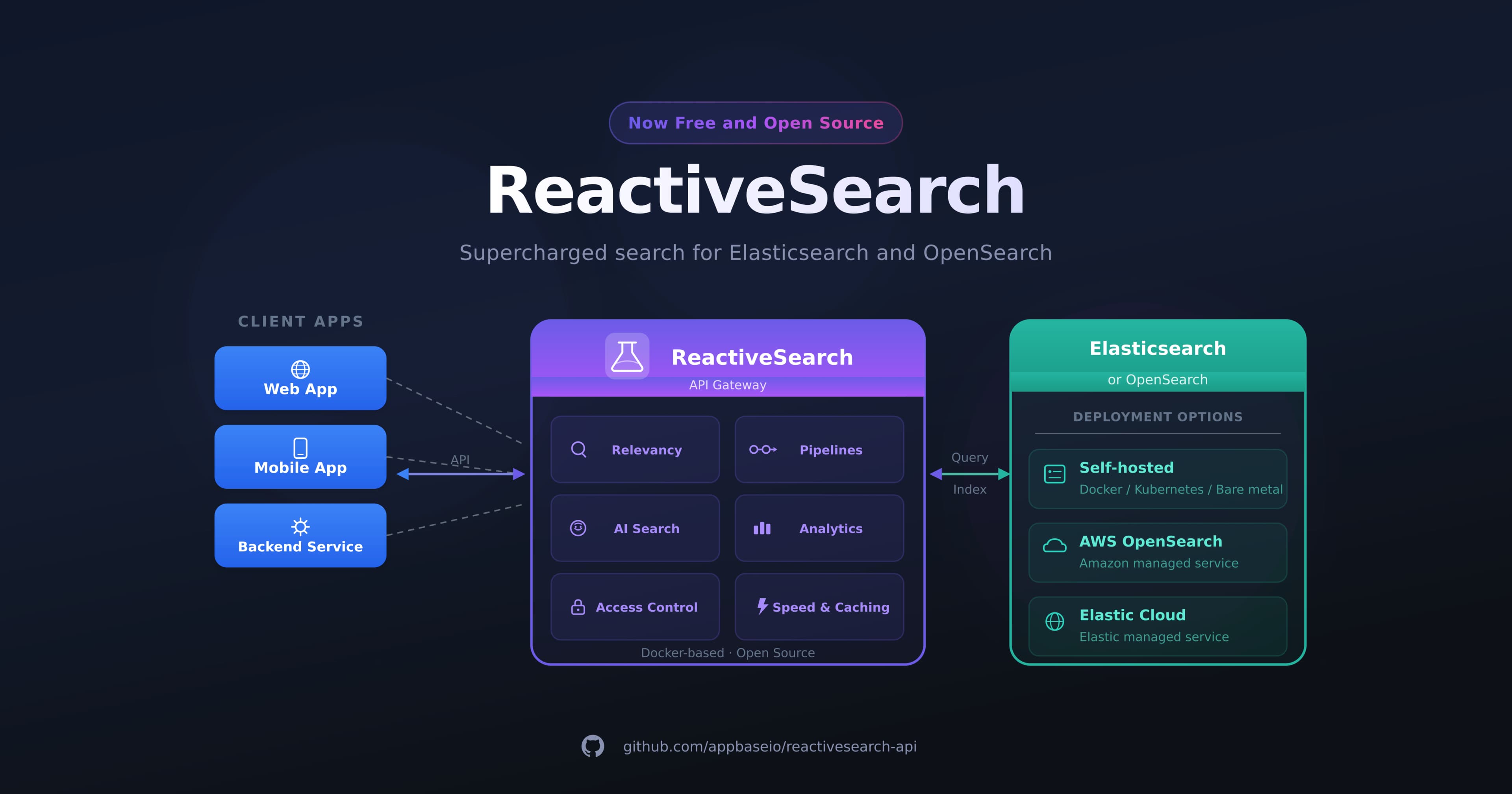
The SearchBox component from the @appbaseio/reactivesearch library provides a powerful way to build reactive search UIs that are connected to one or more Elasticsearch indices. It comes with many different props that enable you to customize the user interface and behavior of the search box in various ways. In this post, we'll explore some of the different SearchBox UIs you can create by leveraging these props.
Let's take a look at how the SearchBox component can be used in multiple ways to cover different use cases.
Voice Search
One interesting way to enhance the SearchBox is to enable voice search. You can do this by setting the showVoiceSearch prop to true. This adds a microphone icon to the search box, allowing users to search using their voice instead of typing. This can be especially useful for users on mobile devices or for those with accessibility needs.
    <SearchBox
        // ... other props
        showVoiceSearch={true}
    />
Autosuggestion Search
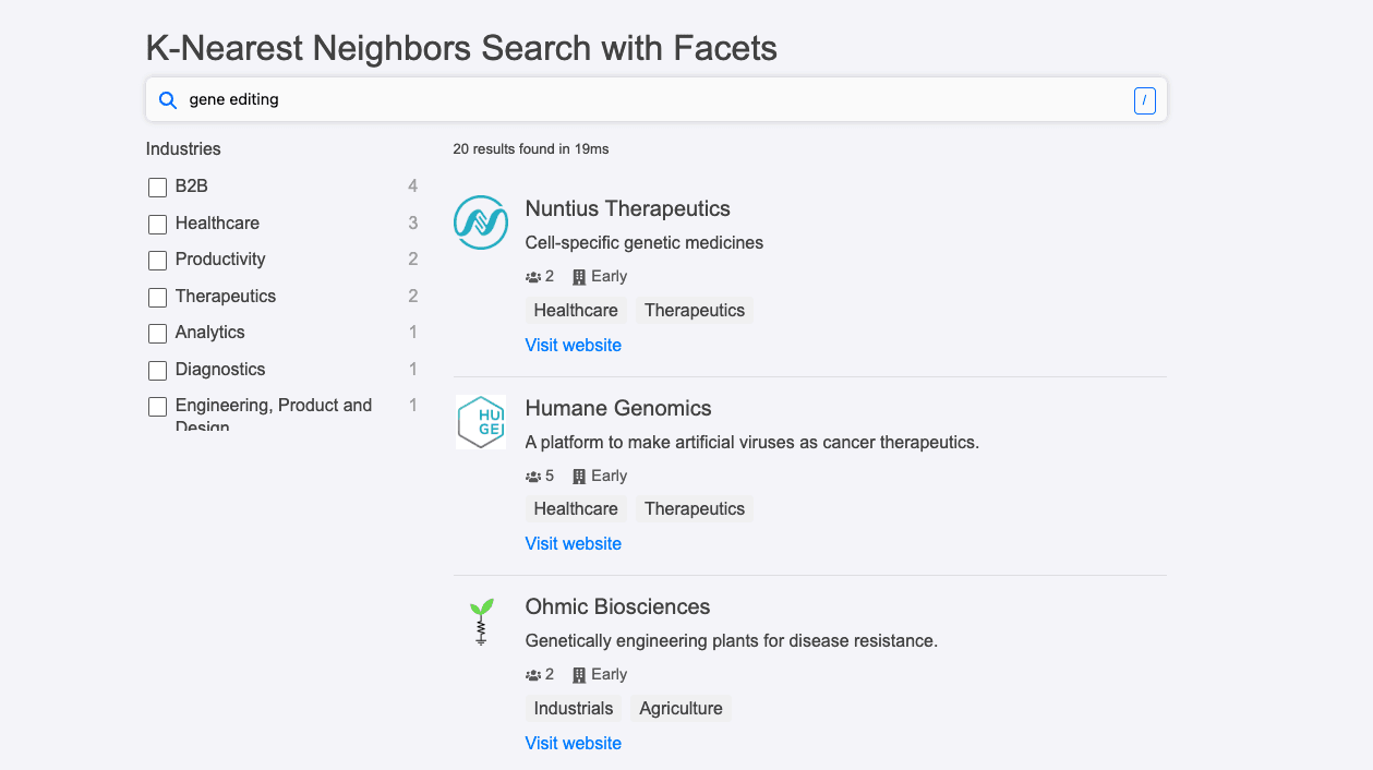
Another powerful feature of the SearchBox is its ability to provide autosuggestions to users as they type. This can be accomplished using the autosuggest prop. When autosuggest prop is set to true, the SearchBox will query the index for suggestions based on the user's input. There are different types of autosuggestions you can enable using other props:
Index Suggestions - Index suggestions are suggestions that show up from the indexed data in your search engine.
Popular Suggestions - Popular suggestions are displayed from collecting the end-user search data based on popularity.
Recent Suggestions - Recent suggestions are displayed from the current user's recent searches.
You can individually configure how each of these suggestions show when you enable autosuggestions.
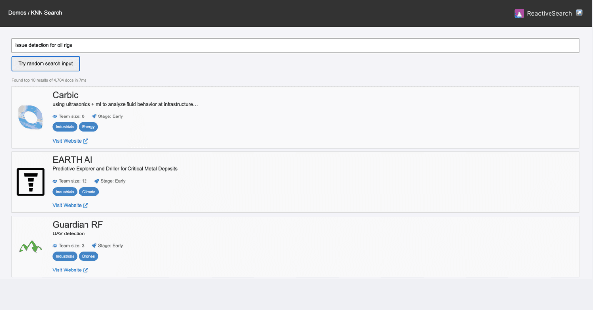
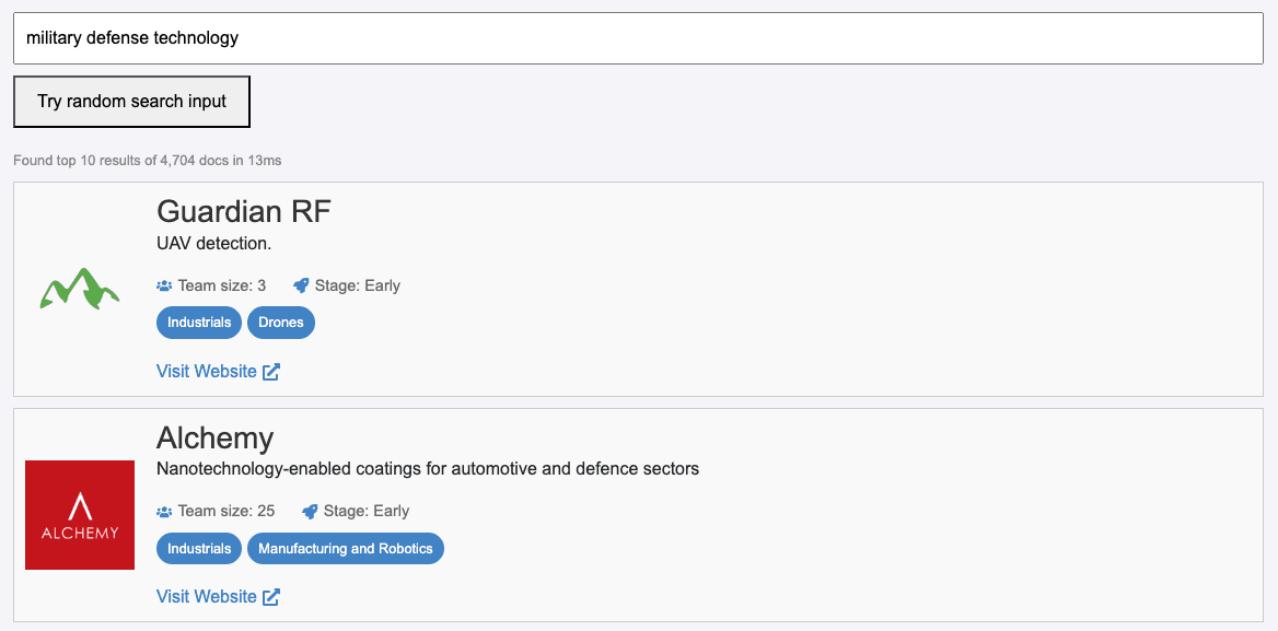
Instant Search
One of the most powerful features is instant search, which allows search results to update in real time as the user types in the search box. This can be enabled by setting the autosuggest prop to false. With instant search, users can quickly see which search terms are yielding the most relevant results, and adjust their query as needed.
    <SearchBox
        // ... other props
        autosuggest={false}
    />
Keyboard Shortcuts
Another useful feature is keyboard shortcuts, which can improve the speed and efficiency of the search process. The focusShortcuts prop allows you to define a list of keyboard shortcuts that will focus the search box when pressed.
For example, if you want to focus the search box when the user presses the / key, you can set focusShortcuts to ['/']. You can also define more complex keyboard shortcuts, such as SHIFT+A, by separating the key names with a +.
The string is case-insensitive and space in-between is optional. You can also pass several shortcuts ["SHIFT+A", "SHIFT+B"].
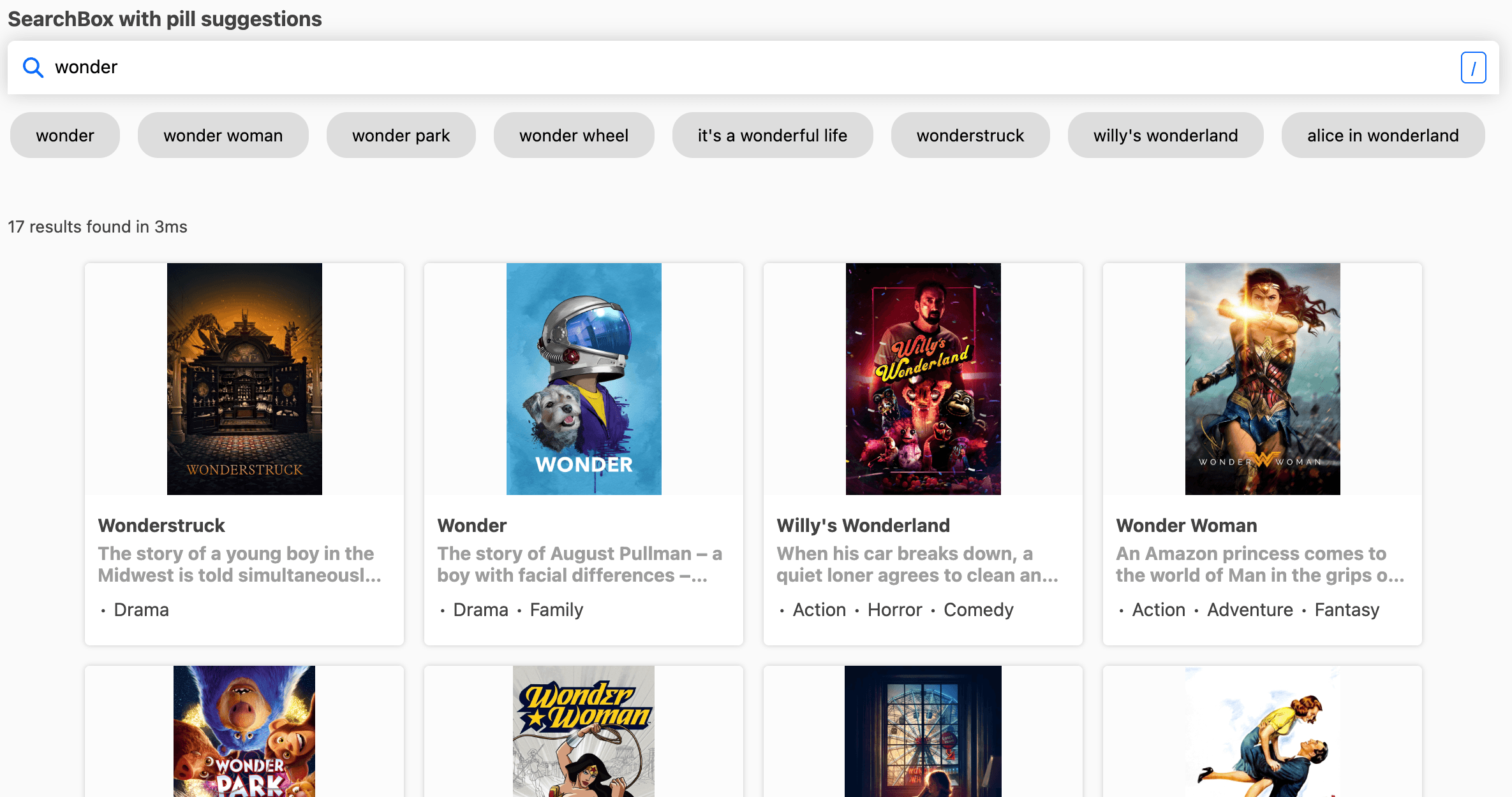
Instant Search with Pill based Suggestions
Combine Instant Search with Pill-based Suggestions to provide users with a highly interactive search experience. Instant Search offers real-time search results, while Pill-based Suggestions enable users to refine their search with predefined tags or filters displayed as pill-shaped buttons. This combination helps users easily navigate large datasets by providing a structured and intuitive way to explore data. It also reduces the likelihood of spelling errors or other mistakes, as users can quickly select the appropriate tag or filter to refine their search results.
The example here uses:
controlled usage for triggering the result query as per the user's wish/ needs. Click here to know more 🔗
renderprop to render suggestions in a pill-based 💊 UI. Click here to know more 🔗
Tag-based Search UI
Create a highly customizable search experience with the Tag-based search UI, allowing users to select multiple search terms from a list of suggestions. Use the renderSelectedTags prop to define custom rendering functions for selected tags, offering users a more visually appealing interface or adding extra functionality to the tags.
<SearchBox
    componentId="searchSensor"
    // ... other props
    mode="tag"
/>
renderSelectedTags is used to custom render tags when the mode is set to tag.
Function param accepts an object with the following properties:
values:Array<String>is an array of selected valueshandleClear:Function - (string) => voidis a function to clear a tag value. It accepts the tag value(String) as a parameterhandleClearAll:Function - () => voidis a function to clear all selected values
    <SearchBox
        id="search-component"
        mode="tag"
        renderSelectedTags={({
            values = [],
            handleClear,
            handleClearAll }) => {
                // return custom-rendered tags
            }
        }
    />
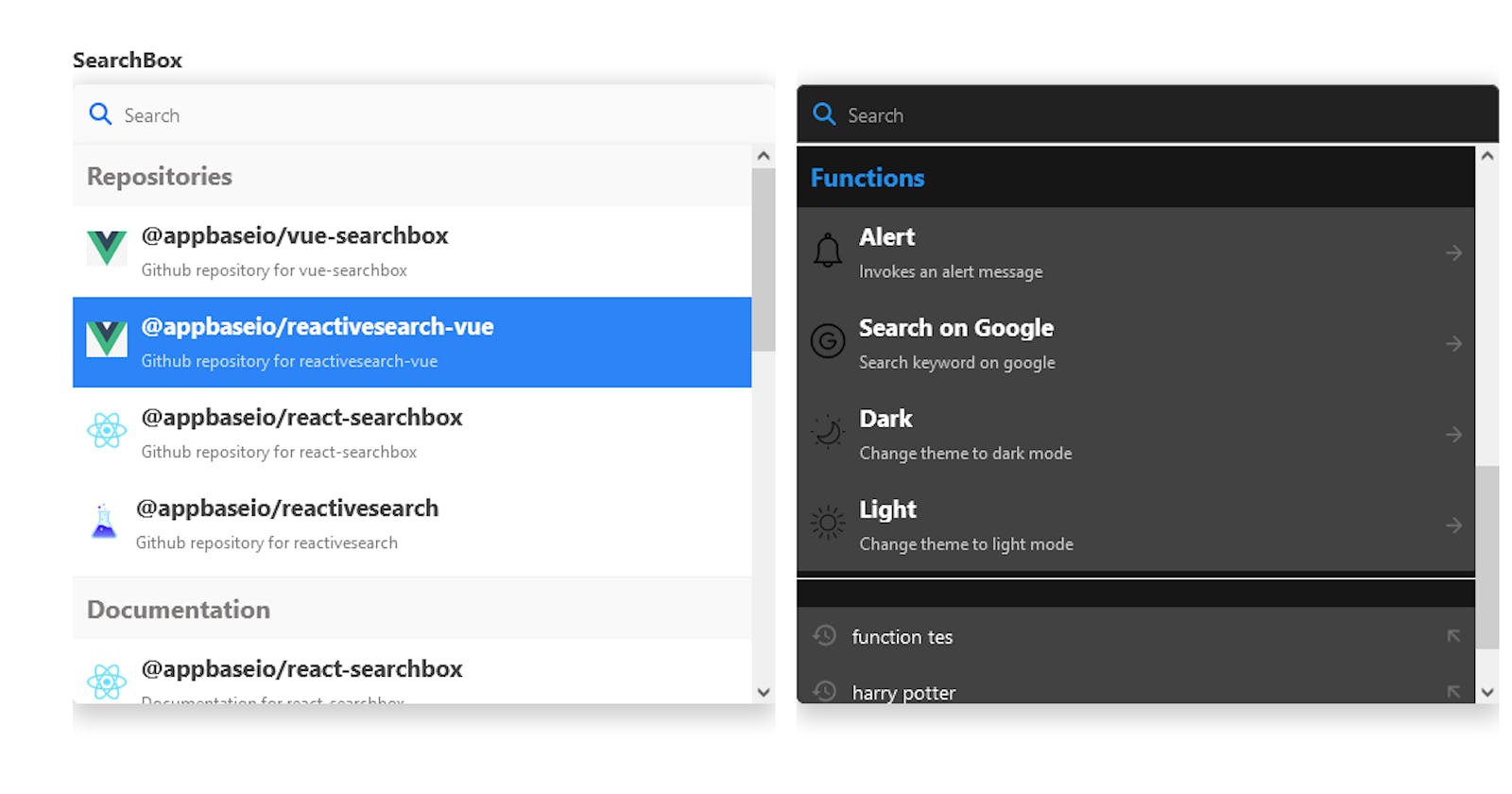
Featured Suggestions
Featured suggestions are a powerful feature in Reactive Search that can be used to display a set of custom search suggestions at the top of your search results. These suggestions are designed to be prominently displayed to your users and can be used to guide them toward popular or high-value search terms.
Some extensive use cases include:
In-app navigation: Offer an in-app navigation experience through your search bar allowing users to navigate through your site or dashboard without needing to jump between multiple menus, or relying on header/footer navigations.
Onboarding of new users: New users who are not familiar with the product or how to use it can just go to the search bar and search for the documentation of the product or search for help if needed. Through the in-app navigation, a user can search for frequently asked questions and navigate to the page effortlessly.
User productivity with actions: When actions like toggling between the light mode or dark mode of your app can be done directly from the search bar, it can further enhance the search user experience.
To enable featured suggestions, you need to first set Featured suggestions via the ReactiveSearch dashboard, and then use the enableFeaturedSuggestions prop with searchboxId at query time.
Following is the dashboard workflow for setting the featured suggestions.
Following is the query time usage for returning featured suggestions.
<SearchBox
    // .. other props
    enableFeaturedSuggestions={true}
    searchboxId="your_created_searchbox_id"
    featuredSuggestionsConfig={{
        maxSuggestionsPerSection: 10,
        sectionsOrder: ['repositories', 'docs', 'functions'],
    }}
/>
Follow this guide to know more about Featured suggestions and how you can build one using the ReactiveSearch Control plane here 🚀.
AI Answer: Coming Soon ⏳
Get an AI Answer powered by ChatGPT, GPT-3 and GPT-4 models right in your SearchBox. Here's an example of how this works.
Summary
In summary, the SearchBox component from the @appbaseio/reactivesearch library enables you to create diverse, user-centric search experiences that cater to a wide range of use-cases. By leveraging its various customization options, you can provide your users with an intuitive, efficient, and engaging search experience that truly meets their needs.
Consider experimenting with different combinations of these features to find the perfect balance for your specific search scenario. As you refine your search experience, you'll be able to deliver an even more engaging experience to your end-users.