

Tutorial: Learn how to create a spotlight like search experience with autocomplete.js and appbase.io
Search, navigate and run custom JavaScript functions - ideal for SaaS apps wanting to build an omnibar or commandbar experience


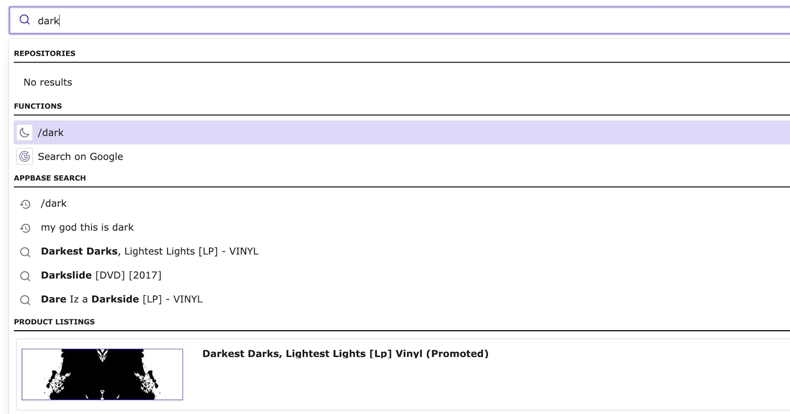
Table of contents
In this post we are going to build a Spotlight like search experience using React and Elasticsearch: a searchbar which can not only search for results but also navigate to links and perform custom tasks. This lets you create a swiss army knife with search as the interface. Whether it is showing search results from your app, docs, external sources, or navigating to menu items or pages, or running an action like switching the app theme or sending out an e-mail, you can do it all!
You can check out the example app we will be building in this post over here.
Beyond searchbox
There are a lot of things we can do improve UX. Making our searchbox go beyond just searching for index results is one of them.
New users not familiar with the interface can get lost and not find features quickly. Help them by enabling discovery of features through search.
Users hate using the mouse. Eliminate the need to use the mouse by getting more done through the keyboard. Navigate pages without even having to click on a link.
If your site has a billion features then your users might not find the correct feature when they need it. Solve the problem of feature discovery through search.
Things needed
We would be building this app using autocomplete.js and autocomplete-suggestions-plugin.
Autocomplete UI
The suggestions which appear while typing, has become a much needed feature for search. It can minimize typing and enable users to search quicker. To build an interactive and accessible autocomplete UI we use autocomplete.js.
Getting data for autocomplete
Building autocomplete UI is just one part of the equation. We need data for our suggestions. We will be using a dataset of songs. We will need an Elasticsearch index to host our data. In this post, we will use reactivesearch.io for doing this but you can also run your own Elasticsearch cluster and create an index. You can also view it in dejavu data browser. We can use below details of the index for configuring the app.
{
  "url": "https://appbase-demo-ansible-abxiydt-arc.searchbase.io",
  "app": "best-buy-dataset",
  "credentials": "b8917d239a52:82a2f609-6439-4253-a542-3697f5545947"
}
In order to use the data, we use autocomplete-suggestion-plugin from ReactiveSearch. Reactivesearch has a wide range of suggestions. It supports popular suggestions based on the trending user searches. Not only that, it supports for recent suggestions, that the current user has last searched. Explore Reactivesearch for learning more.
Building the app
Step 1: Setup
We are going to use CRA for setting up the project. This generates a scaffolding for getting started to use React in a project. Run the below command from a CLI.
npm install -g create-react-app  # install CRA if you don't have it.
npx create-react-app saas-search      # initialize the boilerplate.
cd saas-search
The folder structure would something like below.
saas-search
├── README.md
├── node_modules
├── package.json
├── .gitignore
├── package-lock.json
├── public
│   └── favicon.ico
│   └── index.html
│   └── manifest.json
└── src
    └── App.css
    └── App.js
    └── App.test.js
    └── index.css
    └── index.js
    └── logo.svg
    └── registerServiceWorker.js
We have removed some unnecessary files and folders. You can check the resulting setup.
Step 2: Adding a searchbar
Make a file in src named Autocomplete.js.
We are going to make a autocomplete searchbar using autocomplete.js. Because autocomplete makes changes to the DOM which React is unaware, we have to use an escape-hatch that react provides useRef. We get a reference to a dom node using useRef and then pass it to autocomplete. Autocomplete also does some cleanup by calling search.destroy().
//Autocomplete.js
export function Autocomplete(props) {
  const containerRef = useRef(null);

  useEffect(() => {
    if (!containerRef.current) {
      return undefined;
    }

    // Initialize autocomplete on the newly created container
    const search = autocomplete({
      container: containerRef.current,
      ...props,
    });
    // Destroy the search instance in cleanup
    return () => {
      search.destroy();
    };
  }, [props]);

  return <div ref={containerRef} />;
}
We can then use the Autocomplete searchbar component inside of our app.
//index.js
function App() {
  return (
    <div className="App">
      <Autocomplete openOnFocus={true} defaultActiveItemId={0} />
    </div>
  );
}
Step 3: Theme and styles
Our app doesn't look exciting right now. Let's add some styling and theme to it. We would use a theme from algolia. We would import this theme in Autocomplete.js
//Autocomplete.js
import "@algolia/autocomplete-theme-classic";
We can add some custom styles to configure fonts, colors in App.css. The app should look better.
Step 4: Showing suggestions
Our app looks good by now, but we don't get any suggestions when we type. In this step we would be creating and configuring four plugins. The first two would be created completely from scratch: githubRepoPlugin and functionsPlugin. The other two we would create using autocomplete-suggestions-plugin.
This plugin renders repository links as suggestions. This is a custom plugin created using autocomplete. We have a static array as a data source. Each item contains a label for suggestions and description. Each item also contains information about whether to open the link in a new tab or same tab using target attribute.
//githubReposPlugin.js
const data = [
  {
    label: "@appbaseio/autocomplete-suggestions-plugin (Same tab)",
    description:
      "An appbase.io suggestions plugin for autocomplete.js library from Algolia",
    link: {
      target: "_self",
      url: "https://github.com/appbaseio/autocomplete-suggestions-plugin",
    },
  },
];
The plugin is created as below. <Suggestion/> is a UI component for rendering suggestions. We use the getSources which is used by autocomplete.js to get data for suggestions. We match the query(the search term typed by user) against the label in getItems method. The templates property is used to create custom UI elements for styling. We use item for rendering custom suggestion, but there are many more, whose usage is shown in documentation.. We also have a event handler onSelect which gets called when an item is clicked by the user.
//githubReposPlugin.js
const gitHubReposPlugin = {
  getSources({ query }) {
    return [
      {
        sourceId: "github-repos",
        getItems() {
          return data.filter(({ label }) =>
            label.toLowerCase().includes(query.toLowerCase())
          );
        },
        templates: {
          item({ item }) {
            return <Suggestion item={item} />;
          },
          noResults() {
            return "No results";
          },
        },
        onSelect({ item }) {
          if (item.link.url) window.open(item.link.url, item.link.target);
        },
      },
    ];
  },
};
Step 5: Showing functions as suggestions
We get suggestions, but it is still a normal searchbar. We want to search for functions and perform actions. We would be making a plugin for this as well.
The data for our app would look as below. The structure is same as the githubReposPlugin but we have two new properties: callback and matchAny. callback is used when the suggestion is clicked. It gets passed item as argument. matchAny tells whether to match any query searched by user.
const data = [
  {
    label: "/alert",
    description: "Throws a friendly alert",
    callback: (item) => alert(`An alert was triggered.`),
    icon: bellIcon,
    matchAny: true,
  },
];
The code for plugin is as below. It is similar to githubReposPlugin. We add a header to label this group of suggestions.
//functionsPlugin.js
const functionsPlugin = {
  getSources({ query }) {
    return [
      {
        sourceId: "functions",
        getItems() {
          return data.filter(({ label }) =>
            label.toLowerCase().includes(query.toLowerCase())
          );
        },
        templates: {
          header() {
            return <div className="header">Functions</div>;
          },
          item({ item }) {
            return <Suggestion item={item} icon={item.icon} />;
          },
          noResults() {
            return "No results";
          },
        },
        onSelect({ item }) {
          if (typeof item.callback === "function") item.callback(item);
        },
      },
    ];
  },
};
Dark mode function:
Let's add more functions in suggestions. We would like to toggle theme of our website using our keyboard. We would add this function in data of functionsPlugin.js
//functionsPlugin.js
const data = [
  {
    label: "/dark",
    description: "Enable dark mode",
    callback: () => {
      const bodyElement = document.querySelector("body");
      bodyElement.classList.add("dark");
    },
    icon: moonIcon,
    matchAny: false,
  },
  {
    label: "/light",
    description: "Enable light mode",
    callback: () => {
      const bodyElement = document.querySelector("body");
      bodyElement.classList.remove("dark");
    },
    icon: sunIcon,
    matchAny: false,
  }
]
Google search function: We would now add a function to similar to "Search on google" context menu item. This would take the search query and open in a new tab a google search.
//functionPlugin.js
const data = [
  {
    label: "Search on Google",
    description: "Google search in new window",
    callback: (query) => {
      const queryParam = query.replace(" ", "+");
      //Open in new window
      window.open(`https://www.google.com/search?q=${queryParam}`, "_blank");
    },
    icon: googleIcon,
    matchAny: true,
  },
]
Step 6: Showing suggestions from our index
Our SAAS-searchbar is looking good and can do various things. But we also want it to show suggestions from our index. For that we would be using autocomplete-suggestions-plugin.
Configuration:
First we make some config variables to use in the plugin. This details are available from your appbase cluster.
Below is appbase config with app(index), url and credentials. The settings field is optional.
//config.js
// appbase client config object
export const appbaseClientConfig = {
  url: "https://appbase-demo-ansible-abxiydt-arc.searchbase.io",
  app: "best-buy-dataset",
  credentials: "b8917d239a52:82a2f609-6439-4253-a542-3697f5545947",
  settings: {
    userId: "s@s",
    enableQueryRules: true,
    recordAnalytics: true,
  },
};
Below is reactivesearch config. It is similar to props you would pass to SearchBox component.
//config.js
export const rsApiConfig = {
  highlight: true,
  dataField: [
    {
      field: "name.autosuggest",
      weight: "1",
    },
    {
      field: "name",
      weight: "3",
    },
  ],
  enableRecentSuggestions: true,
  recentSuggestionsConfig: {
    size: 2,
    minHits: 2,
    minChars: 4,
    index: "best-buy-dataset",
  },
  enablePopularSuggestions: true,
  popularSuggestionsConfig: {
    size: 2,
    minChars: 3,
    minCount: 3,
    index: "best-buy-dataset",
  },
  index: "best-buy-dataset",
  size: 5,
};
Default usage:
In order to fetch results from best-buy-dataset index, we need to create a plugin using autocomplete-suggestions-plugin. We can pass the variables created above to the plugin and we are done.
import createSuggestionsPlugin from "@appbaseio/autocomplete-suggestions-plugin";

const defaultUsagePlugin = createSuggestionPlugin(
  appbaseClientConfig,
  rsApiConfig
);
Then you can just pass it inside autocomplete.js..
// Initialize autocomplete on the newly created container
const search = autocomplete({
  container: containerRef.current,
  placeholder: "Search",
  plugins: [defaultUsagePlugin],
});
You would get the suggestions on search.
Advanced usage:
We can customize the UI rendered for suggestions, actions when a suggestion is clicked. We can do so by passing a third parameter to createSuggestionPlugin.
If we want to customize how suggestions get rendered then we can pass a third parameter with a property renderItem. It would be called by autocomplete-suggestion-plugin with props similar to template's item method in autocomplete..
//advancedUsagePlugin.js
const advancedUsagePlugin = createSuggestionsPlugin(
  appbaseClientConfig,
  rsApiConfig,
  {
    //props would be similar to template's item method.
    renderItem: (props) => {
      const { item } = props;
      return (
        <div className="aa-item product-item" target="_blank" rel="noreferrer">
          <div className="product-image">
            <img
              src={
                item._source
                  ? item._source.image
                  : "https://m.media-amazon.com/images/I/81c83vd4O+L._SY879_.jpg"
              }
              alt={item.value}
            />
          </div>
          <div className="product-details">
            <h4>{item.value} (Promoted)</h4>
            <p>
              {item._source
                ? item._source.shortDescription
                : "Samsung offers latest smartphones with advanced technology and design. Buy 3G, 4G, dual sim smartphone at best prices in India."}
            </p>
          </div>
        </div>
      );
    },
  }
);
Similarly, for customizing the UI for header, footer and no suggestions, autocomplete-suggestion-plugin provides us with renderHeader, renderFooter and renderNoSuggestions. Their usage is below.
const advancedUsagePlugin = createSuggestionsPlugin(
  appbaseClientConfig,
  rsApiConfig,
  {
    renderHeader: () => {
      return <div className="header">Product listings</div>;
    },
    renderFooter: (props) => {
      return <hr style={{ borderColor: "#d7d5f5" }} />;
    },
    renderNoResults: (props) => {
      if (props.state.query === "") {
        return <p>Search for something to get direct product suggestions!</p>;
      } else {
        return <p>No products found! Try searching for something else!</p>;
      }
    },
  }
);
We can also customize the action when a user clicks on one of the suggestion displayed. This can be done by passing a callback function as a property onItemSelect.
const advancedUsagePlugin = createSuggestionsPlugin(
  appbaseClientConfig,
  rsApiConfig,
  {
    onItemSelect: (props) => {
      const {
        item: { url, label, type },
        setQuery,
        refresh,
      } = props;

      if (url) {
        window.open(url, "_blank");
      }
    },
  }
);
Similar to default usage, add the plugin to autocomplete.
// Initialize autocomplete on the newly created container
const search = autocomplete({
  container: containerRef.current,
  placeholder: "Search",
  plugins: [advancedUsagePlugin],
});
Live code and demo
Congratulations! We have built a Spotlight like SAAS search completely from scratch. You can watch the demo, and also browse the code.
Summary
Step 1: Setup an app using CRA
Step 2: Make searchbar using algolia autocomplete
Step 4: Show suggestions for github repositories